QuickSight
Amazon QuickSight Visualization for AWS Glue Data Pipeline
After completing the AWS Data Pipeline architecture using Amazon S3, AWS Glue ETL, AWS Glue Data Catalog, and Amazon Redshift, the next step is to visualize the processed data using Amazon QuickSight for analytics and dashboard creation.
In this system:
- Raw data is stored in Amazon S3.
- AWS Glue Crawler scans the dataset and generates metadata.
- AWS Glue Data Catalog manages the schema and metadata.
- AWS Glue ETL Job processes and transforms the data.
- Processed data is loaded into Amazon Redshift.
- Amazon QuickSight connects to Redshift to build analytical dashboards.
Role of Amazon QuickSight in the System
Amazon QuickSight is AWS’s Business Intelligence (BI) service used for data visualization and analytics.
In this pipeline, QuickSight is responsible for:
- Connecting directly to Amazon Redshift.
- Reading processed data generated by AWS Glue ETL.
- Creating analytical dashboards.
- Supporting business intelligence and reporting.
- Visualizing taxi trip and transaction datasets.
- Analyzing revenue, passenger count, trip distance, and pickup trends.
Step 1: Create an Amazon QuickSight Account
The first step is to activate Amazon QuickSight on the AWS account.
Instructions
- Open the AWS Console.
- Search for:
QuickSight
- Select Amazon QuickSight.
- Click:
Sign up for QuickSight
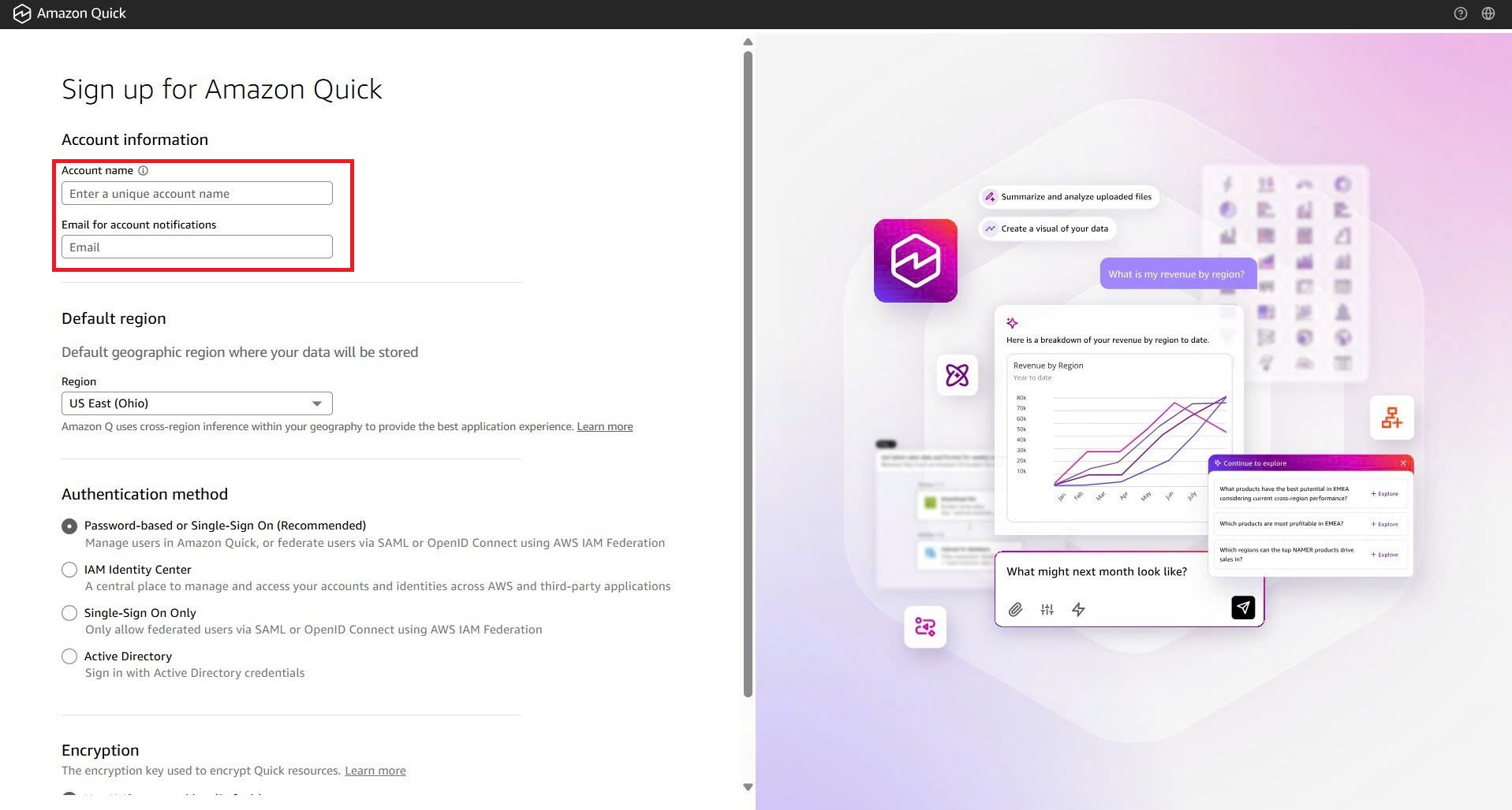
At this stage, the system will display the initial QuickSight account creation interface.
Step 2: Complete QuickSight Account Setup
After entering the required information such as:
- Account name
- Notification email
- Edition type
- AWS service permissions
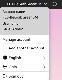
the QuickSight account setup process will be completed successfully.
The user will then be redirected to the QuickSight management dashboard.
Step 3: Enter Amazon Redshift Connection Information
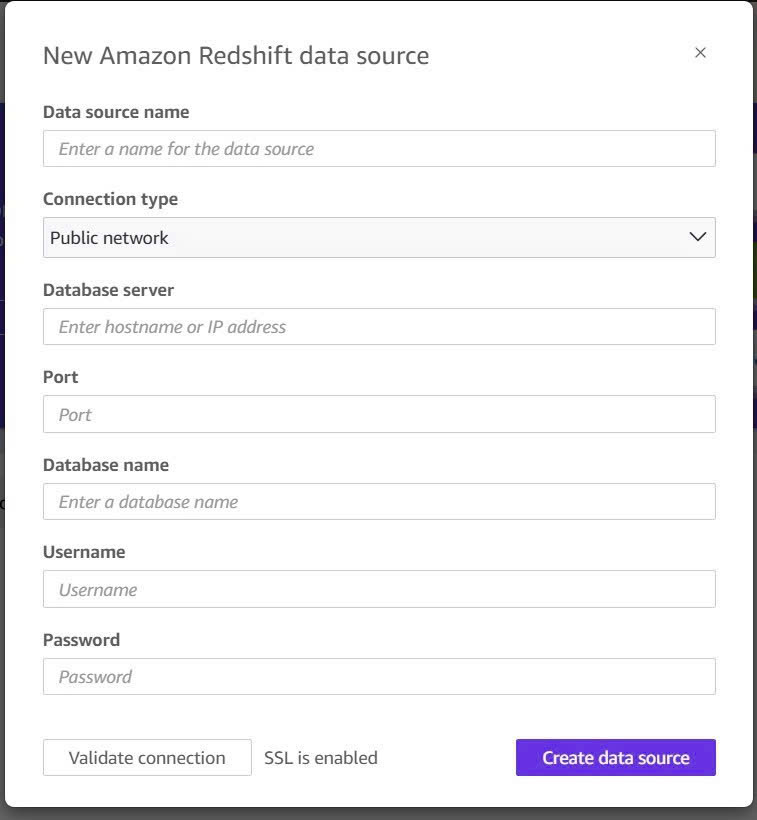
After successfully creating the QuickSight account, the next step is to create a Data Source connection to Amazon Redshift.
Inside the Data Source creation interface:
- Select:
Amazon Redshift
- Enter the Redshift connection details.
The required fields include:
| Field | Description |
|---|---|
| Data source name | Name of the data source |
| Connection type | Public network or VPC |
| Server | Redshift cluster endpoint |
| Port | Redshift port |
| Database | Database name |
| Username | Login username |
| Password | Login password |
Example configuration:
Data source name: glue-pipeline-redshift
Connection type: Public network
Server: redshift-cluster.xxxxxx.ap-southeast-1.redshift.amazonaws.com
Port: 5439
Database: dev
Username: admin
Password: ********
Step 4: Complete Data Source Configuration
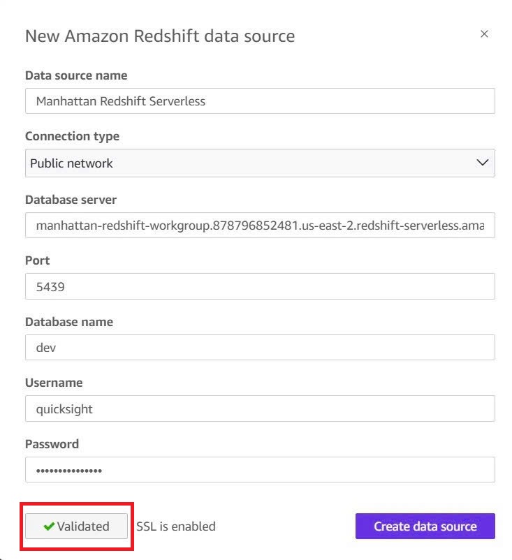
After entering all Redshift connection details:
- Click:
Validate connection
- If the connection is successful, QuickSight will confirm the validation.
- Then click:
Create data source
to create the Redshift Data Source.
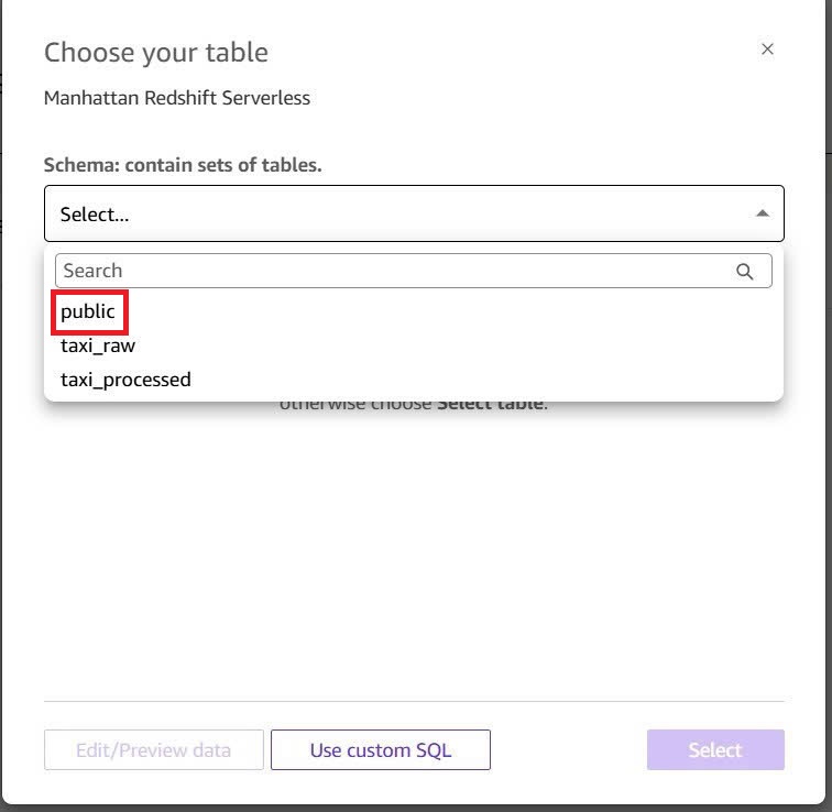
Step 5: Select Schema and Table
After successfully connecting to Redshift, QuickSight will display the available:
- Databases
- Schemas
- Tables
- Views
In this step:
- Select the schema:
public
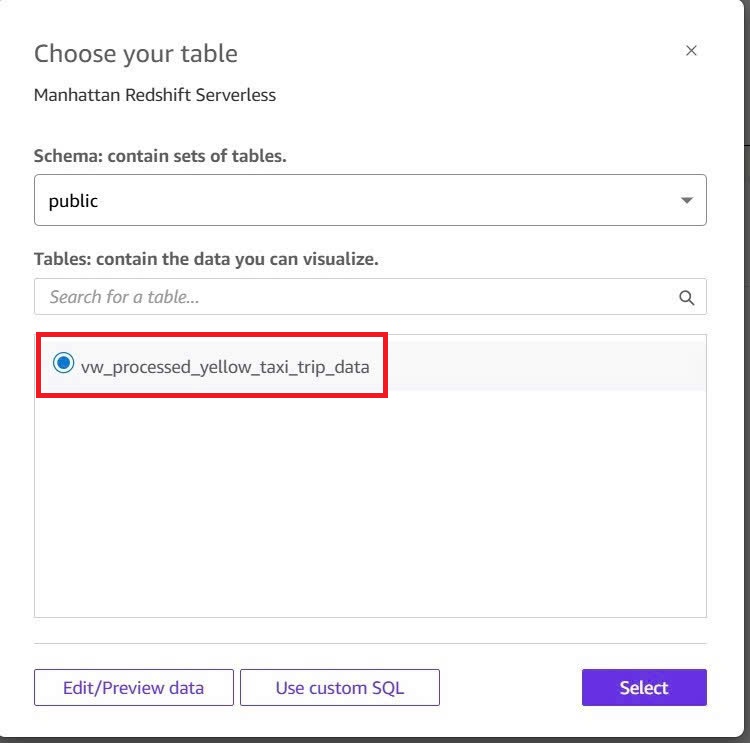
- Select the table processed by AWS Glue ETL.
Example:
yellow_taxi_trip
Step 6: Confirm Dataset Creation
After selecting the table:
- Click:
Select
- QuickSight will create a dataset from the selected Redshift table.
- This dataset will be used for visualization and dashboard creation.
Example Dataset Used in the System
The dataset may contain the following columns:
| Column |
|---|
| VendorID |
| tpep_pickup_datetime |
| tpep_dropoff_datetime |
| passenger_count |
| trip_distance |
| RatecodeID |
| payment_type |
| fare_amount |
| tip_amount |
| total_amount |
| congestion_surcharge |
| Airport_fee |
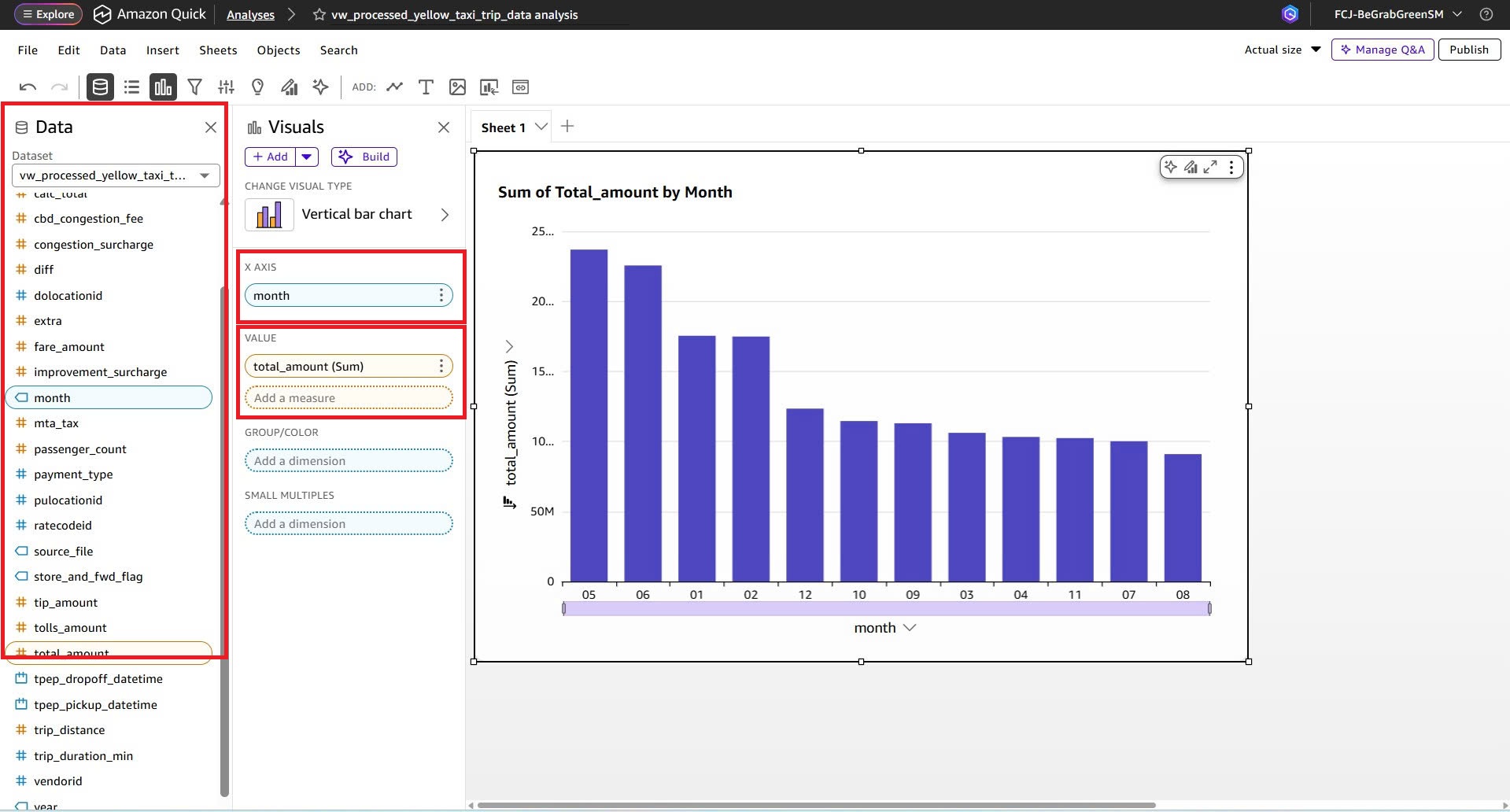
Step 7: Create the First Visualization
After the dataset is loaded successfully:
- Choose a chart type.
- Drag and drop fields from the left panel into the visualization area.
Example:
- X-axis:
payment_type - Value:
sum(total_amount)
This creates a revenue analysis chart based on payment methods.
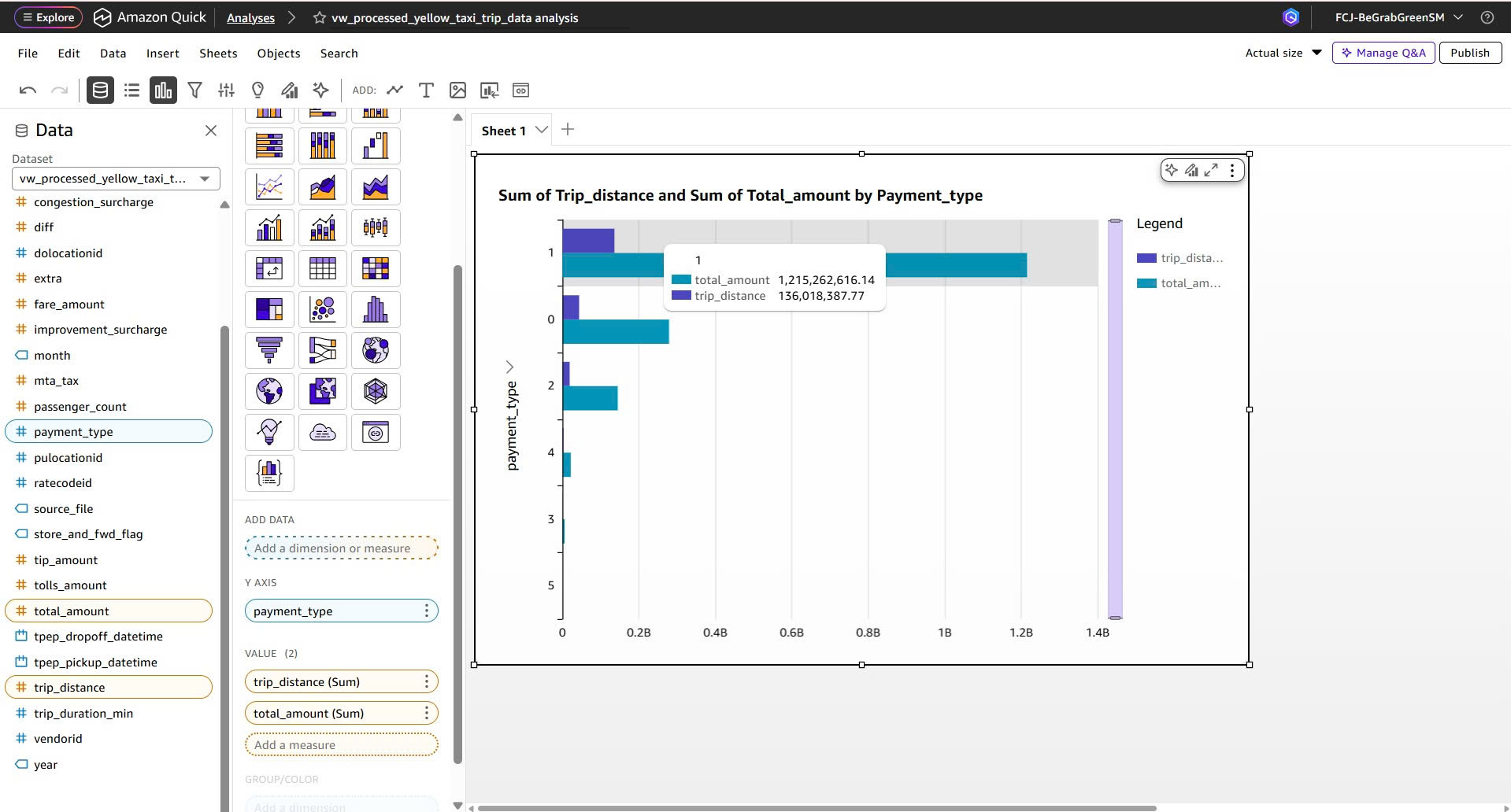
Step 8: Combine Fields for Data Visualization
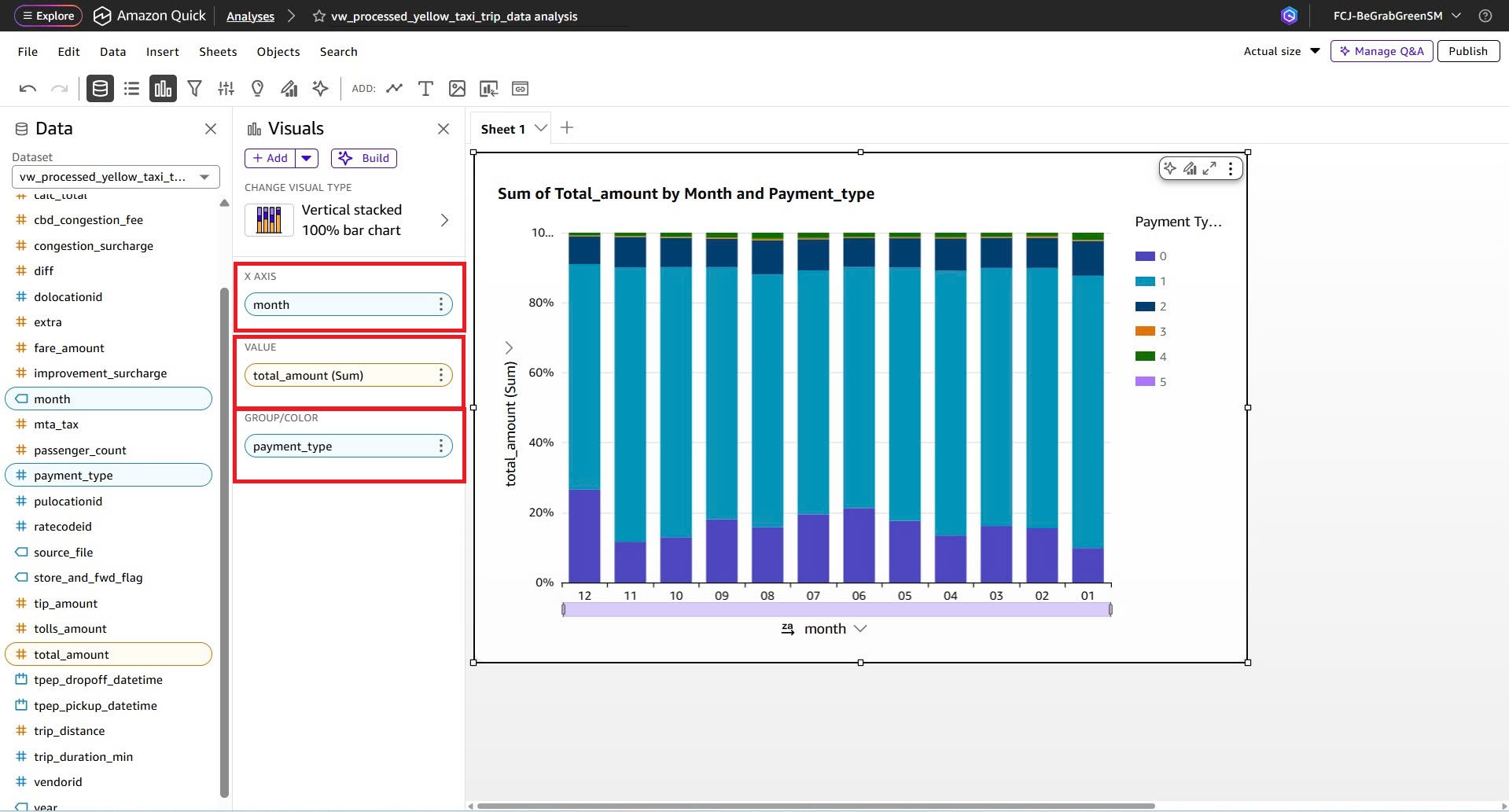
QuickSight allows users to combine fields dynamically to create different visualizations.
Examples of fields used:
tpep_pickup_datetimefare_amounttrip_distancepassenger_count
These fields can be combined to analyze taxi trip data and business metrics.
Step 9: Build Analytics Dashboard
After configuring visualizations:
- Change chart types.
- Add filters.
- Create KPI metrics.
- Combine multiple charts into a dashboard.
Common chart types include:
- Bar Chart
- Line Chart
- Pie Chart
- KPI
- Area Chart
- Heatmap
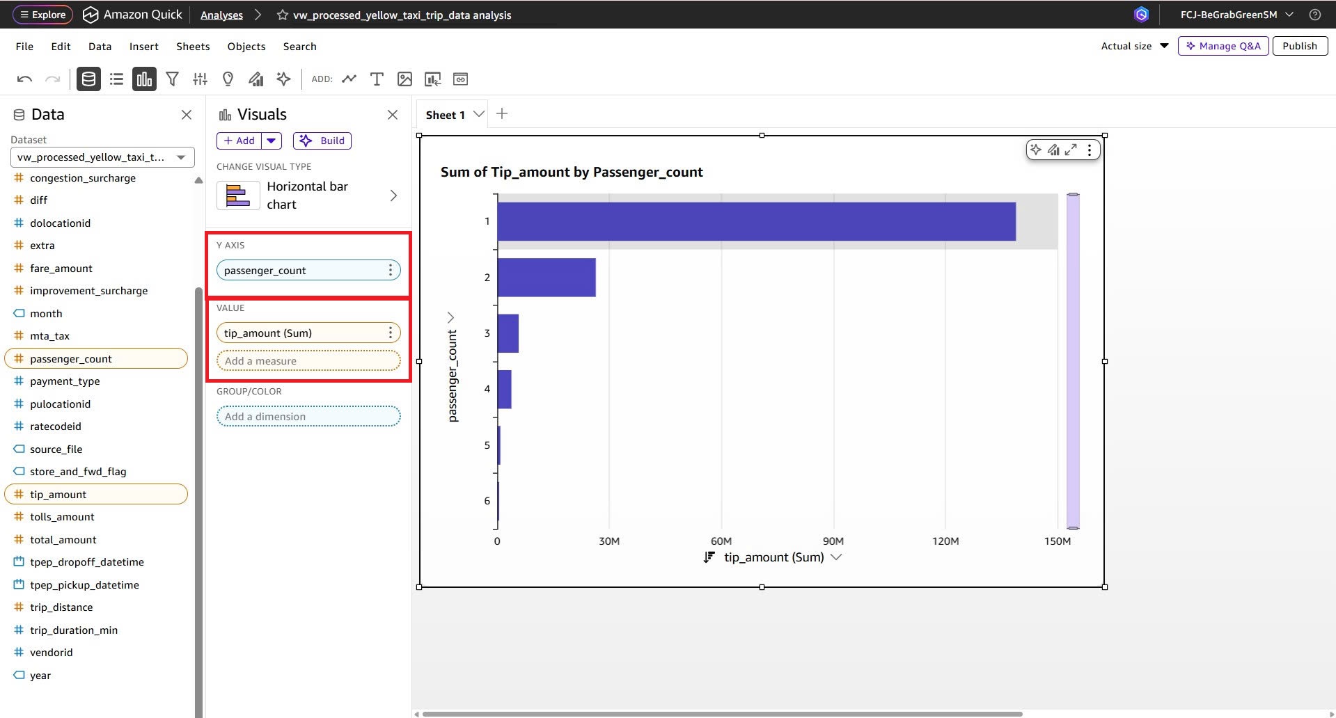
Step 10: Complete the Data Visualization Dashboard
After finishing field configuration and chart customization, QuickSight will generate a complete analytics dashboard.
The dashboard can support:
- Revenue analysis
- Total trip monitoring
- Passenger count analytics
- Pickup time tracking
- Trip distance analysis
- Payment type statistics
Common Issues
1. Unable to Connect to Redshift
Causes
- Incorrect endpoint.
- Port 5439 is blocked by Security Group.
- Redshift is inside a private subnet.
Solutions
- Verify the endpoint.
- Open inbound port 5439.
- Check Publicly Accessible configuration.
2. Tables Not Displayed
Causes
- User lacks SELECT permission.
- Glue ETL has not loaded data.
- Incorrect schema selected.
Solutions
GRANT SELECT ON ALL TABLES IN SCHEMA public TO username;
3. Visualization Displays Null Values
Causes
- ETL processing errors.
- Incorrect data types.
- Dataset not refreshed.
Solutions
- Refresh the dataset.
- Verify Glue ETL Job output.
- Check Redshift data types.
Final Result
After completing all steps:
- AWS Glue successfully processes the data.
- Data is loaded into Amazon Redshift.
- Amazon QuickSight connects successfully to the Data Warehouse.
- Analytical dashboards are fully created.
- The system supports business intelligence and data analytics efficiently.
Complete pipeline:
Raw Data → Glue ETL → Redshift → QuickSight